The Beta-Binomial model is the “hello world” of Bayesian statistics. That is, it’s the first model you get to run, often before you even know what you are doing. There are many reasons for this:
- It only has one parameter, the underlying proportion of success, so it’s easy to visualize and reason about.
- It’s easy to come up with a scenario where it can be used, for example: “What is the proportion of patients that will be cured by this drug?”
- The model can be computed analytically (no need for any messy MCMC).
- It’s relatively easy to come up with an informative prior for the underlying proportion.
- Most importantly: It’s fun to see some results before diving into the theory! 😁
That’s why I also introduced the Beta-Binomial model as the first model in my DataCamp course Fundamentals of Bayesian Data Analysis in R and quite a lot of people have asked me for the code I used to visualize the Beta-Binomial. Scroll to the bottom of this post if that’s what you want, otherwise, here is how I visualized the Beta-Binomial in my course given two successes and four failures:
The function that produces these plots is called prop_model (prop as in proportion) and takes a vector of TRUEs and FALSEs representing successes and failures. The visualization is created using the excellent
ggridges package (
previously called joyplot). Here’s how you would use prop_model to produce the last plot in the animation above:
data <- c(FALSE, TRUE, FALSE, FALSE, FALSE, TRUE)
prop_model(data)
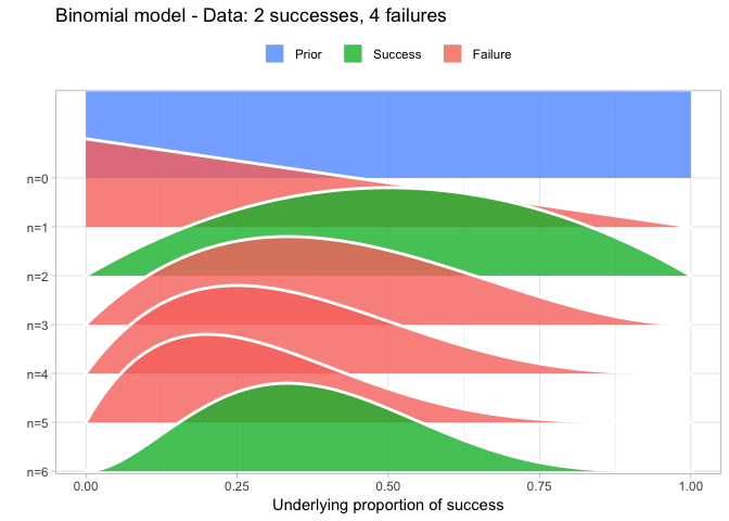
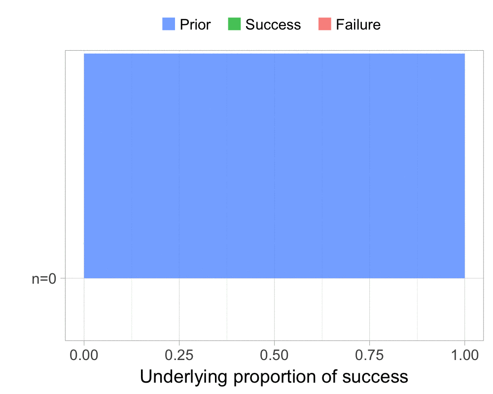
The result is, I think, a quite nice visualization of how the model’s knowledge about the parameter changes as data arrives. At n=0 the model doesn’t know anything and — as the default prior states that it’s equally likely the proportion of success is anything from 0.0 to 1.0 — the result is a big, blue, and uniform square. As more data arrives the probability distribution becomes more concentrated, with the final posterior distribution at n=6.
Some added features of prop_model is that it also plots larger data somewhat gracefully and that it returns a random sample from the posterior that can be further explored. For example:
big_data <- sample(c(TRUE, FALSE), prob = c(0.75, 0.25),
                   size = 100, replace = TRUE)
posterior <- prop_model(big_data)
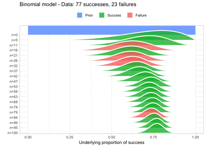
quantile(posterior, c(0.025, 0.5, 0.975))
## 2.5%  50%  98%
## 0.68 0.77 0.84
So here we calculated that the underlying proportion of success is most likely 0.77 with a 95% CI of [0.68, 0.84] (which nicely includes the correct value of 0.75 which we used to simulate big_data).
To be clear, prop_model is not intended as anything serious, it’s just meant as a nice way of exploring the Beta-Binomial model when learning Bayesian statistics, maybe as part of a workshop exercise.
The prop_model function
# This function takes a number of successes and failuers coded as a TRUE/FALSE
# or 0/1 vector. This should be given as the data argument.
# The result is a visualization of the how a Beta-Binomial
# model gradualy learns the underlying proportion of successes
# using this data. The function also returns a sample from the
# posterior distribution that can be further manipulated and inspected.
# The default prior is a Beta(1,1) distribution, but this can be set using the
# prior_prop argument.

# Make sure the packages tidyverse and ggridges are installed, otherwise run:
# install.packages(c("tidyverse", "ggridges"))

# Example usage:
# data <- c(TRUE, FALSE, TRUE, TRUE, FALSE, TRUE, TRUE)
# prop_model(data)
prop_model <- function(data = c(), prior_prop = c(1, 1), n_draws = 10000) {
  library(tidyverse)
  data <- as.logical(data)
  # data_indices decides what densities to plot between the prior and the posterior
  # For 20 datapoints and less we're plotting all of them.
  data_indices <- round(seq(0, length(data), length.out = min(length(data) + 1, 20)))

  # dens_curves will be a data frame with the x & y coordinates for the
  # denities to plot where x = proportion_success and y = probability
  proportion_success <- c(0, seq(0, 1, length.out = 100), 1)
  dens_curves <- map_dfr(data_indices, function(i) {
    value <- ifelse(i == 0, "Prior", ifelse(data[i], "Success", "Failure"))
    label <- paste0("n=", i)
    probability <- dbeta(proportion_success,
                         prior_prop[1] + sum(data[seq_len(i)]),
                         prior_prop[2] + sum(!data[seq_len(i)]))
    probability <- probability / max(probability)
    data_frame(value, label, proportion_success, probability)
  })
  # Turning label and value into factors with the right ordering for the plot
  dens_curves$label <- fct_rev(factor(dens_curves$label, levels =  paste0("n=", data_indices )))
  dens_curves$value <- factor(dens_curves$value, levels = c("Prior", "Success", "Failure"))

  p <- ggplot(dens_curves, aes(x = proportion_success, y = label,
                               height = probability, fill = value)) +
    ggridges::geom_density_ridges(stat="identity", color = "white", alpha = 0.8,
                                  panel_scaling = TRUE, size = 1) +
    scale_y_discrete("", expand = c(0.01, 0)) +
    scale_x_continuous("Underlying proportion of success") +
    scale_fill_manual(values = hcl(120 * 2:0 + 15, 100, 65), name = "", drop = FALSE,
                      labels =  c("Prior   ", "Success   ", "Failure   ")) +
    ggtitle(paste0(
      "Binomial model - Data: ", sum(data),  " successes, " , sum(!data), " failures")) +
    theme_light() +
    theme(legend.position = "top")
  print(p)

  # Returning a sample from the posterior distribution that can be further
  # manipulated and inspected
  posterior_sample <- rbeta(n_draws, prior_prop[1] + sum(data), prior_prop[2] + sum(!data))
  invisible(posterior_sample)
}