I’m often irritated by that when a statistical method is explained, such as linear regression, it is often characterized by how it can be calculated rather than by what model is assumed and fitted. A typical example of this is that linear regression is often described as a method that uses ordinary least squares to calculate the best fitting line to some data (for example, see here, here and here).
From my perspective ordinary least squares is better seen as the computational method used to fit a linear model, assuming normally distributed residuals, rather than being what you actually do when fitting a linear regression. That is, ordinary least squares is one of many computational methods, such as gradient descent or simulated annealing, used to find the maximum likelihood estimates of linear models with normal residuals. By characterizing linear regression as a calculation to minimize the squared errors you hide the fact that linear regression actually assumes a model that is simple and easy to understand. I wish it was more common to write out the full probability model that is assumed when describing a statistical procedure as it would make it easier to quickly grasp the assumptions of the procedure and facilitate comparison between different procedures.
But how to write out the full probability model? In this post I’m going to show two different textual conventions and two different graphical conventions for communicating probability models. (Warning, personal opinions ahead!)
Textual Conventions for Communicating Probability Models
A common textual convention for defining models is by defining all the non-stochastic relations in the model and then add on error terms. Using this error terms convention the model for simple linear regression could be written like this:
$$ y_i = \alpha + \beta x_i + \varepsilon_i$$
$$ \varepsilon_i \sim \text{Normal}(0, \sigma)$$
Where $\alpha$ is the intercept, $\beta$ is the steepness of the slope and $\varepsilon$ is a normally distributed error term. This conventions is commonly used (e.g. in Wikipedia’s linear regression article) but is problematic in some aspects discussed in a minute.
An alternative convention is to instead start with the stochastic relations and then add on the non-stochastic relations. Using this probability distribution centric convention, the simple regression model would be written as:
$$ y_i \sim \text{Normal}(\mu_i, \sigma)$$
$$ \mu_i = \alpha + \beta x_i$$
The distribution centric convention model looks similar to that using the error term convention. They are, however, conceptually difference and I like the distribution centric convention better for a number of reasons:
-
In many cases it is strange to think of the stochastic parts of the model as errors. For example, say you are looking at the relation between height and weight by running a linear regression with height as the predictor and weight as the outcome, where is the error in this model? Using the error term convention the difference between the resulting regression line and the weights would be labeled as the error. But isn’t it strange to talk about the fact that there is variability in how much people weigh, given their length, as an error? Using the distribution centric notation this difference is seen more like a part of the actual model rather than a nuisance measurement error.
-
The distribution centric notation generalizes better to more complex types of models. For example, a simple Poisson regression would be written as
$$ y_i \sim \text{Poisson}(\mu_i)$$
$$ \log(\mu_i) = \alpha + \beta x_i$$
in the distribution centric notation. Notice how similar this model is to the simple linear regression model above. It is, however, not clear how this model should be written using the error term convention.
- A model written using the distribution centric notation is easy to translate to a computational model as many modeling languages, such as WinBugs, Jags and Stan, use a version of this notation.
Given that the distribution centric notation has many advantages over the error term notation and that many statistical procedures are succinctly described by writing out the assumed model, it is a bit surprising that this is not done more often. For example, non of the most basic statistical models are written out using this notation on Wikipedia (see t-test, ANOVA, simple linear regression, Poisson regression, logistic regression and multinomial logistic regression).
Graphical Conventions for Communicating Probability Models
In a model that consists of many distributions, parameters and variables the relations between these entities can be tricky to tease out, even if the full model is written out using the distribution centric notation. This is especially true when the model is Bayesian as you have to define priors for all parameters. In such a situation a graphical representation of the model can help. I know of two conventions for such graphical models, the directed acyclic graph (DAG) convention and the type of diagrams John Kruschke uses in his book Doing Bayesian Data Analysis.
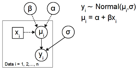
The diagram below show the simple regression model depicted using the DAG convention:

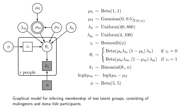
There are many different versions of this convention but the diagram above follows the convention established by the BUGS program. That is, constants are denoted by rectangles, entities assumed to have a distribution (such as parameters and data) are denoted by circles, stochastic dependency is shown by solid arrows and logical dependency by dashed arrows. Because the actual stochastic and functional relations are not shown directly in the DAG, a diagram like this has to be accompanied by the model definition. A good guide to building these type of diagrams in $\LaTeX$ can be found here. If you want to see this type of diagrams in action, check out the excellent BUGS examples or Lee and Wagenmakers upcoming book Bayesian Cognitive Modeling. An example of a more complex DAG from this last book is shown below:

While you need to cross-reference between the diagram and the model definition quite a lot to make sense of the model, I still believe the diagram helps by showing which parameters and variables are related.
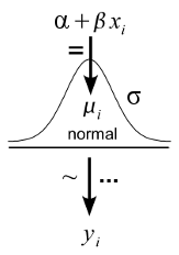
The Kruschke style diagrams makes the model definition redundant by incorporating it into the diagram. Here is the simple linear regression model again:

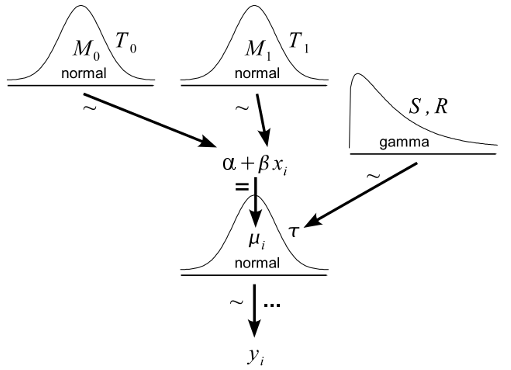
Here the arrow adornment ‘=’ indicate a logical relationship, ‘~’ indicate a stochastic relationship and ‘…’ indicate iteration. As pointed out by Kruschke this diagram convention has a number of benefits over the DAG convention with the two major ones being that (1) the distributional assumptions are shown graphically and (2) there is no need for cross-referencing a model definition as everything is shown in the diagram. The Kruschke style diagrams are very good at showing off Bayesian models (not surprising, since Kruschke use them to teach Bayesian statistics) and the following diagram shows the same old regression model but now with added prior distributions (this diagram is a modified version of a diagram appearing in Doing Bayesian Data Analysis).

I believe that it is almost always better to have some graphical representation of a model than non at all. But which one to use? When comparing the two conventions above I strongly prefer the Kruschke style diagrams. Looking at a Kruschke style diagram gives me a much better idea of what is going on much faster. Which parameters relates to which variables? What distributions are used? It is immediately visible in a Kruschke style diagram. This type of diagram does not work all the time, however. If the model is large and includes deep hierarchies, a Kruschke style diagram will become a bit unwieldy. Advanced indexing or reparameterizations could also be difficult to express using a Kruschke style diagram. But when it works, I believe Kruschke style diagrams are a great tool for communicating models.
Currently there is an ongoing discussion over at John Kruschkes blog about the pros and cons of this type of diagram. If you want to create this type of diagram yourself you might find it useful to check out an R-script I’ve made. It allows you to create iconic diagrams of the most common probability distributions, using these it is easy to make Kruschke style diagrams using, for example, Inkscape or Libre Office Draw.