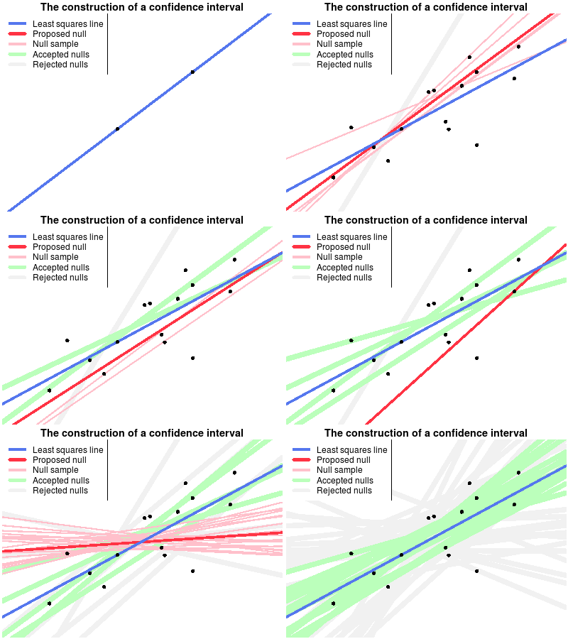
I’m playing blog ping-pong with John Kruschke’s Doing Bayesian Data Analysis blog as he was partly inspired by my silly post on Bayesian mascots when writing a nice piece on Icons for the essence of Bayesian and frequentist data analysis. That piece, in turn, inspired me resulting in the following wobbly backhand.
The confidence interval is, for me, one of the more tricky statistical concepts. As opposed to p-values and posterior distributions which can be explained to a newbie “pretty easily” (especially using John’s nice plots), I find that the concept of confidence intervals is really hard to communicate. Perhaps the easiest way to explain confidence intervals is as a bootstrap procedure (which is beautifully visualized here). However, when I’ve tried this explanation it seems like people often end up believing that confidence intervals are more or less like credible intervals.
Another way of explaining confidence intervals is as the region of possible null hypotheses resulting in corresponding significance tests that are not rejected. This explanation is harder to make than the bootstrap explanation, perhaps due to the double negation in the last sentence. Turns out it wasn’t easy to make a corresponding nice explanatory animation either, but that’s what I tried to do anyway…
The following animation shows the construction of a confidence interval for an ordinary least squares regression. First the the data is plotted and the least squares line is calculated. Then a null hypothesis line is randomly drawn and using this line a test is made whether this null hypothesis can be rejected or not. The scatter of thinner red lines shows lines drawn from the sampling distribution of the null hypothesis line. This is repeated a number of times and the null hypothesis lines that are not rejected form the confidence band of the regression line.

I’m reasonably happy with this animation even though it turned out a bit messy and difficult to take in. But that’s perhaps because confidence intervals is a difficult concept… Note that the method for randomly drawing the null lines does not matter as long as the whole confidence band eventually gets covered. Here I’ve chosen to draw the nulls from a distribution centered on the regression line in order to make the animation work better. Note also that this method of generating a confidence interval, by testing randomly drawn null hypotheses, is generally not used, rather a method is used that gives a similar confidence interval to that which would have resulted if a very large number of random null lines had been tested.
The animation was done in R using the animation package.