Making a slight digression from last month’s
Probable Points and Credible Intervals here is how to summarize a 2D posterior density using a highest density ellipse. This is a straight forward extension of the highest density interval to the situation where you have a two-dimensional posterior (say, represented as a two column matrix of samples) and you want to visualize what region, containing a given proportion of the probability, that has the most probable parameter combinations. So let’s first have a look at a fictional 2D posterior by using a simple scatter plot:
plot(samples)

Whoa… that’s some serious over-plotting and it’s hard to see what’s going on. Sure, the bulk of the posterior is somewhere in that black hole, but where exactly and how much of it?
A highest posterior density ellipse shows this by covering the area that contains the most probable parameter combinations while containing p% of the posterior probability. Like finding the highest density interval corresponds to finding the shortest interval containing p% of the probability, finding the highest density ellipse corresponds to finding the smallest ellipse containing p% of the probability a.k.a. the minimum volume ellipse. I have spent a lot of time trying to figure out how compute minimum volume ellipses. Wasted time, it turns out, as it can be easily computed using packages that come with R, you just have to know what you are looking for. If you just want the code skip over the next paragraph, if you want to know the tiny bit of detective work I had to do to figure this out, read on.
To find the points in sample that are included in a minimum volume ellipse covering, say, 75% of the samples you can use cov.mve(samples, quantile.used = nrow(samples) * 0.75) from the
MASS package, here quantile.used specifies the number of points in samples that should be inside the ellipse. It uses an approximation algorithm described by
Van Aelst, S. and Rousseeuw, P. (2009) that is not guaranteed to find the minimum volume ellipse but that will often be pretty close. A problem is that cov.mve does not return the actual ellipse, it returns a robustly measured covariance matrix, but that’s not really what we are after. It does return an object that contains the indices of the points that are covered by the minimum volume ellipse, if fit is the object returned by cov.mve then these points can be extracted like this: points_in_ellipse <- samples[fit$best, ]. To find the ellipse we are going to use ellipsoidhull from the
cluster package on the points_in_ellipse. It returns an object which represents the minimum volume ellipse and by using its predict function we get a two column matrix with points that lie on the hull of the ellipse and that we can finally plot.
That wasn’t too easy to figure out, but it’s pretty easy to do. The code below plots a 75% minimum volume / highest density ellipse:
library(MASS)
library(cluster)
# Finding the 75% highest density / minimum volume ellipse
fit <- cov.mve(samples, quantile.used = nrow(samples) * 0.75)
points_in_ellipse <- samples[fit$best, ]
ellipse_boundary <- predict(ellipsoidhull(points_in_ellipse))
# Plotting it
plot(samples, col = rgb(0, 0, 0, alpha = 0.2))
lines(ellipse_boundary, col="lightgreen", lwd=3)
legend("topleft", "50%", col = "lightgreen", lty = 1, lwd = 3)
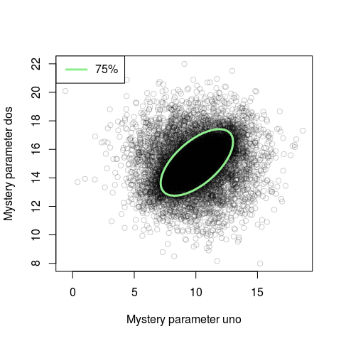
Looking at this new plot we see that for the bulk of the probability mass the parameters are correlated. This correlation was not really visible in the naive scatter plot. If you rerun this code many times you will notice that the ellipse changes position slightly each time. This is due to cov.mve using an non-exact algorithm. If you have a couple of seconds to spare you can make cov.mve more exact by setting the parameter nsamp to a large number, say nsamp = 10000.
You are, of course, not limited to drawing just outlines and if you want to draw shaded ellipses you can use the polygon function. The code below draws three shaded highest density ellipses of random color with coverages of 95%, 75% and 50%.
plot(samples, col = rgb(0, 0, 0, alpha = 0.2))
for(coverage in c(0.95, 0.75, 0.5)) {
  fit <- cov.mve(samples, quantile.used = nrow(samples) * coverage)
  ellipse_boundary <- predict(ellipsoidhull(samples[fit$best, ]))
  polygon(ellipse_boundary, col = sample(colors(), 1), border = NA)
}
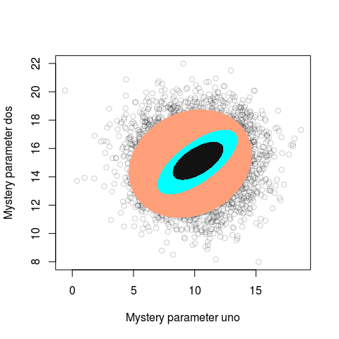
Looks like modern aRt to me!
A Handy Function for Plotting Highest Density Ellipses
The function bellow adds a highest density ellipse to an existing plot created using base graphics:
# Adds a highest density ellipse to an existing plot
# xy: A matrix or data frame with two columns.
#     If you have to variables just cbind(x, y) them.
# coverage: The percentage of points the ellipse should cover
# border: The color of the border of the ellipse, NA = no border
# fill: The filling color of the ellipse, NA = no fill
# ... : Passed on to the polygon() function
add_hd_ellipse <- function(xy, coverage, border = "blue", fill = NA, ...) {
  library(MASS)
  library(cluster)
  fit <- cov.mve(xy, quantile.used = round(nrow(xy) * coverage))
  points_in_ellipse <- xy[fit$best, ]
  ellipse_boundary <- predict(ellipsoidhull(points_in_ellipse))
  polygon(ellipse_boundary, border=border, col = fill, ...)
}
So to replicate the above plot with the 75% highest density ellipse you could now write:
plot(samples)
add_hd_ellipse(samples, coverage = 0.75, border = "lightgreen", lwd=3)
Some Other Options when Plotting 2D Posteriors
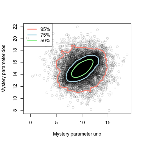
Obviously, a highest density ellipse is only going to work well if the posterior is roughly elliptical. If this is not the case, an alternative is to use a 2D kernel density estimator on the samples and trace out the coverage boundaries. The function HPDregionplot in the
emdbook package does exactly this:
library(emdbook)
plot(samples, col=rgb(0, 0, 0, alpha = 0.2))
HPDregionplot(samples, prob = c(0.95, 0.75, 0.5), col=c("salmon", "lightblue", "lightgreen"), lwd=3, add=TRUE)
legend("topleft", legend = c("95%", "75%", "50%"), col = c("salmon", "lightblue", "lightgreen"), lty=c(1,1,1), lwd=c(3,3,3))
You could also plot a 2d histogram of the samples, for example, using the hexagon plot in
ggplot2:
qplot(samples[,1], samples[,2], geom=c("hex"))
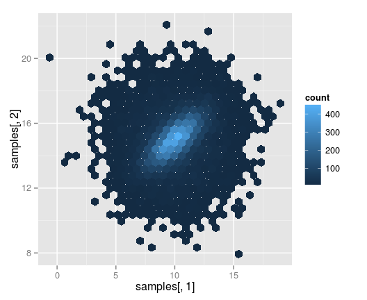
However you would have to work a bit with the color scheme if you wanted the colors to correspond to a given coverage.
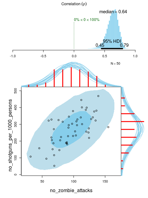
Finally, if you plot a 2D density it could also be useful to add marginal density plots, as is done in the default plot for the Bayesian First Aid alternative to the correlation test. Here with completely fictional data on the number of shotguns and the number of zombie attacks per state in the U.S:
library(BayesianFirstAid)
fit <- bayes.cor.test(no_zombie_attacks, no_shotguns_per_1000_persons)
plot(fit)
References
Van Aelst, S. and Rousseeuw, P. (2009), Minimum volume ellipsoid. Wiley Interdisciplinary Reviews: Computational Statistics, 1: 71–82. Doi: 10.1002/wics.19, link to the paper (unfortunately behind paywall)