Upon discovering that the tiny town I live in has a pinball arcade with over 40 tables (!), I got a bout of pinball fever. I fancy myself a fairly accomplished video game player, but was disappointed to discover that my ability to keep Mario alive didn’t translate to preventing the pinball from draining. Assuming I just needed a bit of practice, I downloaded a virtual version of Fish Tales — a fun, fishing-based table from 1992 — and began practicing. Here’s the data and quick analysis of how I improved over 100 games of Fish Tales.
(By the way, if you didn’t know, the hobbyist pinball emulation scene is amazing. Almost every real pinball table from the last 70 years has been painstakingly 3D-model by someone and is available completely for free, but completely not legally…)

In total, I played 100 games over the course of 10 sessions. The game ran perfectly on my 2022 MacBook Pro at 120 FPS, with non-noticeable input latency. I made sure to learn all the rules of Fish Tales (even though Fish Tales is considered a simple game, the ruleset is non-obvious and opaque), and I played in a distraction-free environment (that is, when the kids weren’t around). And yet, my scores improved like this:
Plot code
library(tidyverse)
library(ggside)
library(atsar)
library(rstan)
library(ggpubr)

scores <- read_csv("fish_tale_scores.csv")
scores |>
  ggplot(aes(x = game, y = score)) +
  geom_point() +
  scale_y_log10(labels = scales::comma) +
  theme_minimal() +
  labs(title = "Pinball scores by game", x = "Game", y = "Score")
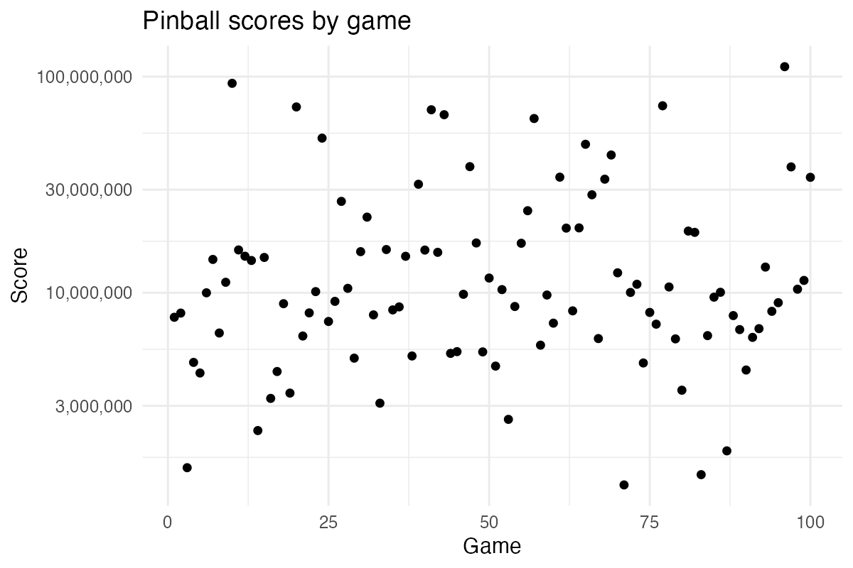
Here the scores (raw data available here) are shown on a log scale, as the score in Fish Tale, like in many other pinball games, sometimes snowball and sometimes never go anywhere.
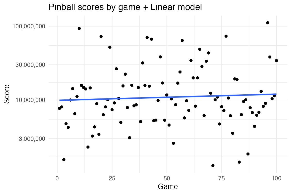
Looking at my score trajectory, it might be easy to dismiss as not much of a trajectory at all. However, maybe we’re just lacking the right model here. But how to model data like this? Maybe a simple linear trend, while hard to justify from a theoretical perspective, could work here?
Plot code
scores |>
  ggplot(aes(x = game, y = score)) +
  geom_point() +
  geom_smooth(method = 'lm', formula = 'y ~ x', se=FALSE) +
  scale_y_log10(labels = scales::comma) +
  theme_minimal() +
  labs(title = "Pinball scores by game + Linear model", x = "Game", y = "Score")
On the other hand, as we’re looking to model an improvement in proficiency, a sigmoid ( ∫ ) model might be more appropriate. That is, I’m starting from a baseline, then I’m seeing an accelerated rate of improvement, which eventually tapers off as I reach my “performance plateau”.
Plot code
scores |>
  ggplot(aes(x = game, y = score)) +
  geom_point() +
  geom_smooth(
    method = 'nls', formula = 'y ~ SSlogis(x, Asym, xmid, scal)', se = FALSE
  ) +
  scale_y_log10(labels = scales::comma) +
  theme_minimal() +
  labs(title = "Pinball scores by game + Sigmoid model", x = "Game", y = "Score")
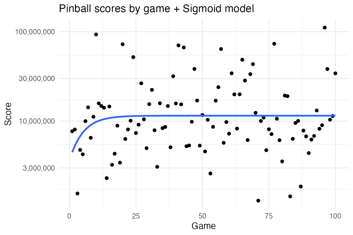
Hmm, that plateau came quickly… Nevertheless, both these models are missing what every good statistical model needs: a good measure of uncertainty and a computationally expensive model fitting procedure. Maybe a Bayesian state-space time series model is what we need here!
Model code
library(atsar)
ss_model <- fit_stan(
  scores$log2_score,
  model_name = "ss_rw",
  est_drift=FALSE,
  mcmc_list=list(n_mcmc=10000, n_burn=2000, n_thin=1, n_chain=3)
)
Plot code
bayes_pred <- 2^rstan::summary(ss_model)$summary |>
  as_tibble(rownames = "param") |>
  filter(str_starts(param, "pred")) |>
  mutate(game = as.numeric(str_extract(param, "\\d+"))) |>
  select(game, lower = `2.5%`,  pred = `50%`, upper = `97.5%`)

scores |>
  ggplot(aes(x = game, y = score)) +
  geom_point() +
  geom_smooth(se=FALSE, method = 'loess', formula = 'y ~ x') +
  geom_ribbon(
    data = bayes_pred,
    aes(x = game, y = pred, ymin = lower, ymax = upper),
    alpha = 0.3
  ) +
  scale_y_log10(labels = scales::comma) +
  theme_minimal() +
  labs(
    title = "Pinball scores by game + Bayesian state space model",
    x = "Game", y = "Score"
  )
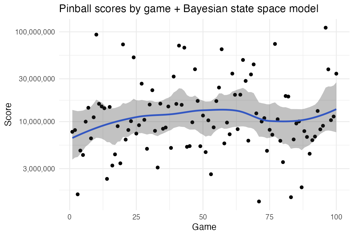
Or we could just go full 101 psychology statistics and force this data to submit to a t-test, using violence if necessary.
Plot code
scores |>
  mutate(Group = ifelse(game <= 50, "Games 1 to 50", "Games 51 to 100") ) |>
  ggboxplot(
    x = "Group", y = "score",
    color = "Group", palette = "jco",
    add = "jitter",
    title="Pinball scores by game, psychology stats-style"
  ) +
  scale_y_log10(labels = scales::comma) +
  stat_compare_means(method = "t.test")
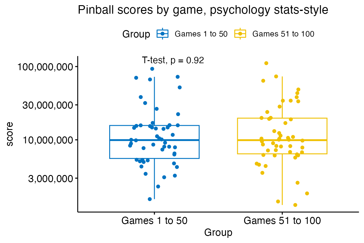
Despite there being at least seven things abhorrently wrong with this approach, we still get a p-value that no amount of p-hackery can fix.
I asked on Mastodon what a good model could be for this type of data and Michael Szell promptly responded:
 Lognormal, absolutely, that makes a
lot of sense. But the stationary assumption, that hurts… and, yet, it’s
hard to argue against:
Plot code
breaks = c(3000000, 10000000, 30000000, 100000000)

scores |>
  ggplot(aes(x = game, y = log(score))) +
  geom_point() +
  scale_y_continuous(breaks = log(breaks), labels=scales::label_comma()(breaks)) +
  theme_minimal() +
  labs(title = "Pinball scores by game + Indepented (😭) Normal distribution (log scale)", x = "Game", y = "Score") +
  geom_ysidehistogram(bins = 12) +
  geom_ysidefunction(fun = \(x) 45 * dnorm(x, mean(log(scores$score)), sd(log(scores$score))), colour = "red") +
  theme(ggside.panel.scale.y = 0.3)
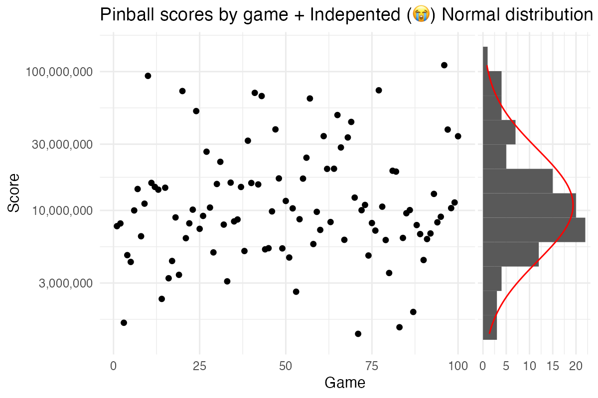
Given that we’ve now nailed the statistical model, I don’t need anymore feedback here. But if you know how I could improve my pinball game, please don’t hesitate to pester me over at @rabaath@fosstodon.org.