Hello stranger, and welcome! 👋😊
I'm Rasmus Bååth, data scientist, engineering manager, father, husband, tinkerer,
tweaker, coffee brewer, tea steeper, and, occasionally, publisher of stuff I find
interesting down below👇
The Matlab syntax for creating matrices is pretty and convenient. Here is a 2x3 matrix in Matlab syntax where , marks a new column and ; marks a new row:
[1, 2, 3;
 4, 5, 6]
Here is how to create the corresponding matrix in R:
matrix(c(1,4,2,5,3,6), 2, 3)
##      [,1] [,2] [,3]
## [1,]    1    2    3
## [2,]    4    5    6
Functional but not as pretty, plus the default is to specify the values column wise. A better solution is to use rbind:
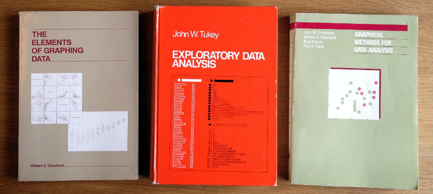
I just wanted to plug for three classical books on statistical graphics that I really enjoyed reading. The books are old (that is, older than me) but still relevant and together they give a sense of the development of exploratory graphics in general and the graphics system in R specifically as all three books were written at Bell Labs where the S-language was developed. What follows is not a review but just me highlighting some things that I liked about these books. So, without further ado, here they are:
As spring follows winter once more here down in southern Sweden, the two sample t-test follows the one sample t-test. This is a continuation of
the Bayesian First Aid alternative to the one sample t-test where I’ll introduce the two sample alternative. It will be a quite short post as the two sample alternative is just more of
the one sample alternative, more of using John K. Kruschke’s
BEST model, and more of the coffee yield data from the 2002 Nature article The Value of Bees to the Coffee Harvest.

It is my great pleasure to share with you a breakthrough in statistical computing. There are many statistical tests: the t-test, the chi-squared test, the ANOVA, etc. I here present a new test, a test that answers the question researchers are most anxious to figure out, a test of significance, the significance test. While a test like the two sample t-test tests the null hypothesis that the means of two populations are equal the significance test does not tiptoe around the canoe. It jumps right in, paddle in hand, and directly tests whether a result is significant or not.
The significance test has been implemented in R as signif.test and is ready to be sourced and run. While other statistical procedures bombards you with useless information such as parameter estimates and confidence intervals signif.test only reports what truly matters, the one value, the p-vale.

For your convenience signif.test can be called exactly like t.test and will return the same p-value in order to facilitate p-value comparison with already published studies. Let me show you how signif.test works through a couple of examples using a dataset from the
RANDOM.ORG database:
Having no personal mug at the department I recently created a Bayesian themed one with the message “Make the Puppies Happy. Do Bayesian Data Analysis.” This is of course a homage to the cover of Johns K. Kruschke’s extraordinary book Doing Bayesian Data Analysis. I also ordered some extra copies of the mug and posted to some Bayesian “heroes” of mine and yesterday I got a mug back from
Christian Robert (!) and an awesome one too! Here they are together with a not so interested cat (no treats in the mugs…)

Student’s t-test is a staple of statistical analysis. A quick search on
Google Scholar for “t-test” results in 170,000 hits in 2013 alone. In comparison, “Bayesian” gives 130,000 hits while “box plot” results in only 12,500 hits. To be honest, if I had to choose I would most of the time prefer
a notched boxplot to a t-test. The t-test comes in many flavors: one sample, two-sample, paired samples and Welch’s. We’ll start with the two most simple; here follows the Bayesian First Aid alternatives to the one sample t-test and the paired samples t-test.

Update:
pingr is now on CRAN! Due to requests from the CRAN mantainers the ping() function had to be renamed beep() in order to not be confused with the Unix tool
ping. Thus the package is now called beepr instead and can be downloaded from CRAN by running the following in an R session:
install.packages("beepr")
So just replace pingr and ping with beepr and beep below, otherwise everything is the same :)
Original post:
pingr is an R package that contains one function, ping(), with one purpose: To go ping on whatever platform you are on (thanks to the
audio package). It is intended to be useful, for example, if you are running a long analysis in the background and want to know when it is ready. It’s also useful if you want to irritate colleagues. You could, for example, use ping() to get notified when your package updates have finished:
update.packages(ask=FALSE); ping()
The binomial test is arguably the conceptually simplest of all statistical tests: It has only one parameter and an easy to understand distribution for the data. When introducing null hypothesis significance testing it is puzzling that the binomial test is not the first example of a test but sometimes is introduced long after the t-test and the ANOVA (as
here) and sometimes is not introduced at all (as
here and
here). When introducing a new concept, why not start with simplest example?
It is not like there is a problem with students understanding the concept of null hypothesis significance testing too well. I’m not doing the same misstake so here follows the Bayesian First Aid alternative to the binomial test!
So I have a secret project. Come closer. I’m developing an R package that implements Bayesian alternatives to the most commonly used statistical tests. Yes you heard me, soon your t.testing days might be over! The package aims at being as easy as possible to pick up and use, especially if you are already used to the classical .test functions. The main gimmick is that the Bayesian alternatives will have the same calling semantics as the corresponding classical test functions save for the addition of bayes. to the beginning of the function name. Going from a classical test to the Bayesian version will be as easy as going from t.test(x1, x2, paired=T) to bayes.t.test(x1, x2, paired=T).
The package does not aim at being
some general framework for Bayesian inference or
a comprehensive collection of Bayesian models. This package should be seen more as a quick fix; a first aid for people who want to try out the Bayesian alternative. That is why I call the package Bayesian First Aid.

I’m playing blog ping-pong with John Kruschke’s
Doing Bayesian Data Analysis blog as he was partly inspired by my silly
post on Bayesian mascots when writing a nice piece on
Icons for the essence of Bayesian and frequentist data analysis. That piece, in turn, inspired me resulting in the following wobbly backhand.
The confidence interval is, for me, one of the more tricky statistical concepts. As opposed to p-values and posterior distributions which can be explained to a newbie “pretty easily” (especially using
John’s nice plots), I find that the concept of confidence intervals is really hard to communicate. Perhaps the easiest way to explain confidence intervals is as a bootstrap procedure (which is beautifully visualized
here). However, when I’ve tried this explanation it seems like people often end up believing that confidence intervals are more or less like
credible intervals.
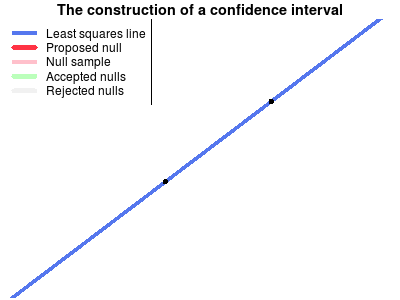
Another way of explaining confidence intervals is as the region of possible null hypotheses resulting in corresponding significance tests that are not rejected. This explanation is harder to make than the bootstrap explanation, perhaps due to the double negation in the last sentence. Turns out it wasn’t easy to make a corresponding nice explanatory animation either, but that’s what I tried to do anyway…
The following animation shows the construction of a confidence interval for an ordinary least squares regression. First the the data is plotted and the least squares line is calculated. Then a null hypothesis line is randomly drawn and using this line a test is made whether this null hypothesis can be rejected or not. The scatter of thinner red lines shows lines drawn from the sampling distribution of the null hypothesis line. This is repeated a number of times and the null hypothesis lines that are not rejected form the confidence band of the regression line.